Label Slider
Introduction
Label Slider is a slider alike Higher Order Component, providing a way to customize the slider labels and images.
We'll still use the example of air conditioner. Similar as State Button, you might want to provide a fancy way to change the air volume of air conditioner by dragging a slider. When the slider is dragged & moved, the volume changed accordingly, and there's a highlighted label aside showing that which tick is the slider currently at, and maybe you want to show another image indicating the strongess of the volume vividly. This is a pretty common case which the Label Slider comes in for.
Label Slider has the following wrapped widgets:
- Container (x1): provides the background of the HoC
- Images (x3): provide images for the states
- Labels (x3): provide labels for the states
- Slider (x1): provides interactive behavior
Label Slider has the following attributes:
-
States
Config how many states the HoC has, and each state has:
- 3 configurable images at max
- 3 configurable labels at max
-
Current state
The current state of the HoC, you can change it to see how the the HoC changes.
Slider Label
As we said, there're 3 configurable labels at max. But actually one of them is semi-configurable, it's the slider label, the one aside to the slider. The vertical (as for vertical slider) or horizontal (as for horizontal slider) position of the label is auto calculated to keep align with the slider's tick. In other words, you can only change how far away the label is from the slider.
Label Slider Edit
By default, Label Slider will show two images and the slider labels. If you want to show more images and labels, you can right click the HoC and select Edit to go into HoC editor to change default config.
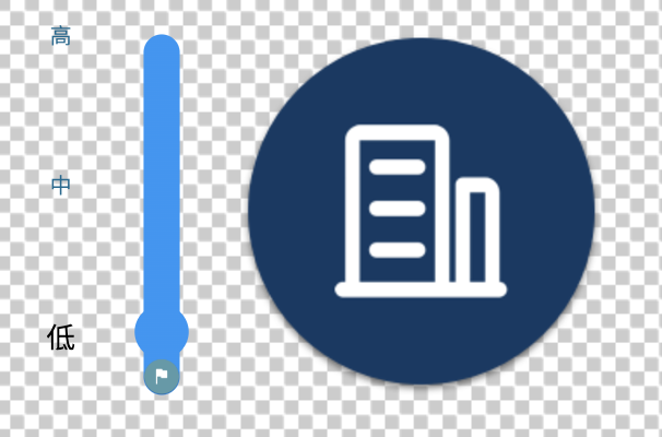
Label Slider with default config looks like below:

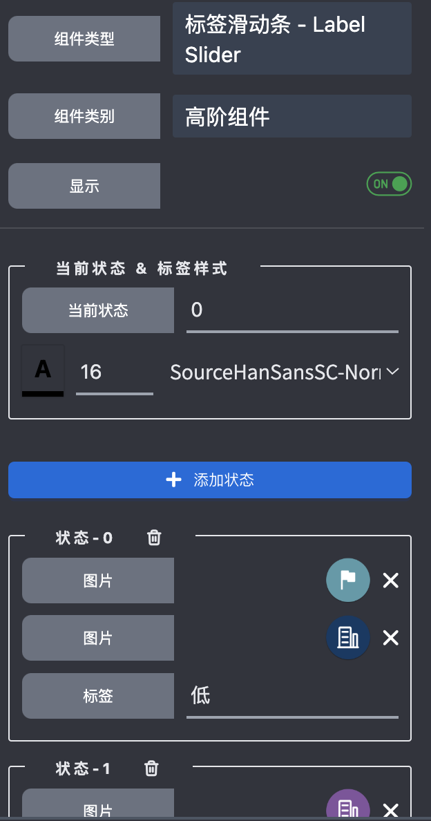
The setting looks like below:

If you want to place the images & labels in another way, just right click and change them, similar with State Button.
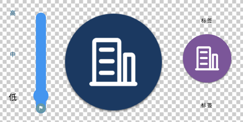
Label Slider with all the widgets unhidden looks like:

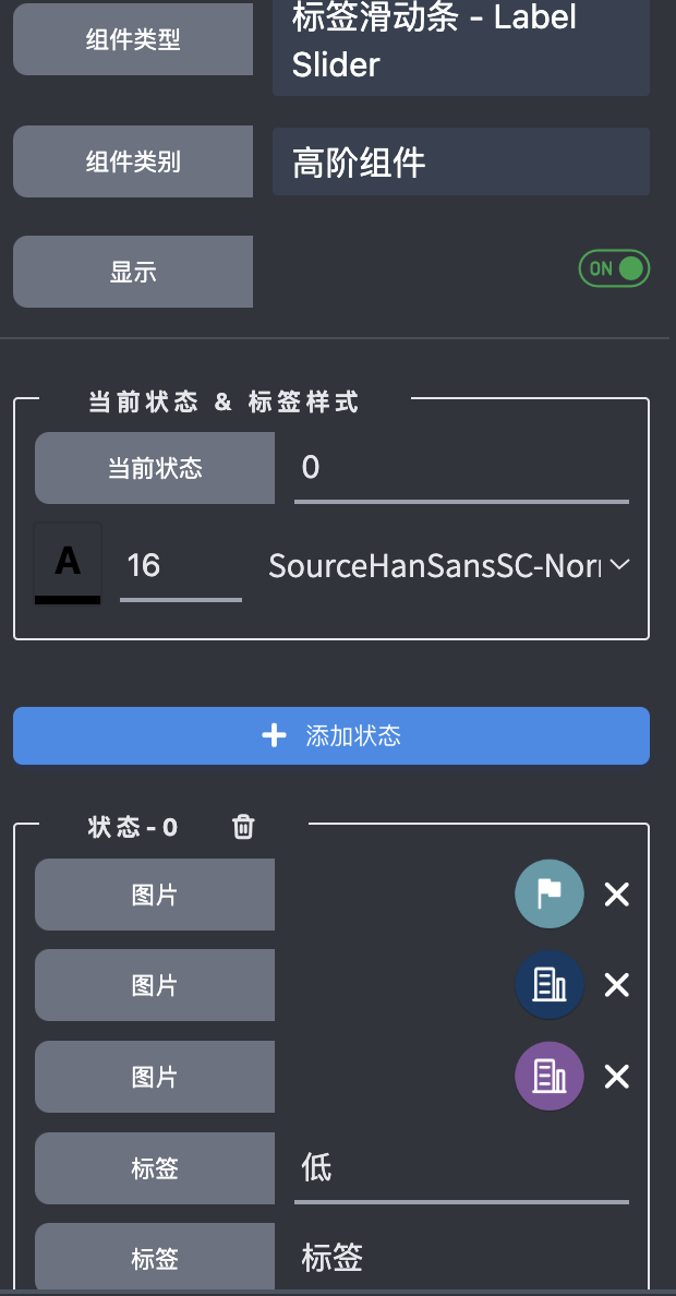
And the setting looks like:
