State Button
Introduction
State Button is a button alike Higher Order Component provding multi-states.
There's a common scenario that a button could have multiple states. When it's clicked, it'll go from one state to another looply. For example, an air conditioner has a button to control the air volume: Low -> Medium -> High -> Auto -> Low -> ... As for each state, it has different images and labels showing. It's impossible to do this by using regular LVGL widget like Button or Image Button, without writing a bunch of custom code.
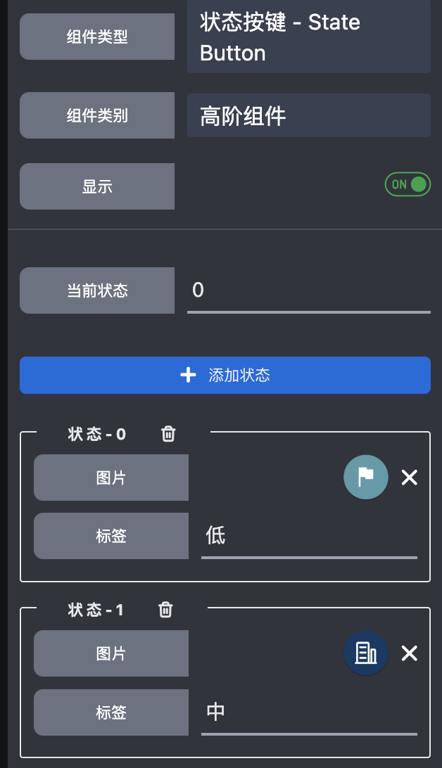
State Button is designed to solve this problem. You can config states of the button, as for each state, you can configure images and labels respectively. When the state changes, the configured images and labels will change synchronously.
State Button has the following wrapped widgets:
- Container (x1): provides background of the HoC
- Images (x3): provide images for the states
- Labels (x3): provide labels for the states
- Button (x1): provides interactive response, transparent by default so only the images & labels & background will be seen.
State Button has the following attributes:
-
States
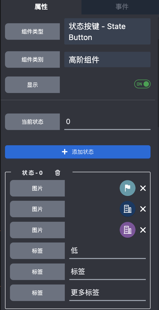
Config how many states the HoC has, and each state has:
- 3 configurable images at max
- 3 configurable labels at max
-
Current state
The current state of the HoC, you can change it to see how the HoC changes.
State Button Edit
By default, State Button will show one image and one label. If you want to show more images and labels, you can right click the HoC and select Edit to go into HoC editor to change default config.
State Button with default config looks like below:
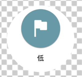
The setting looks like below:
Most likely, you won't place the images & labels as above shows. It's OK, just right click and edit them.
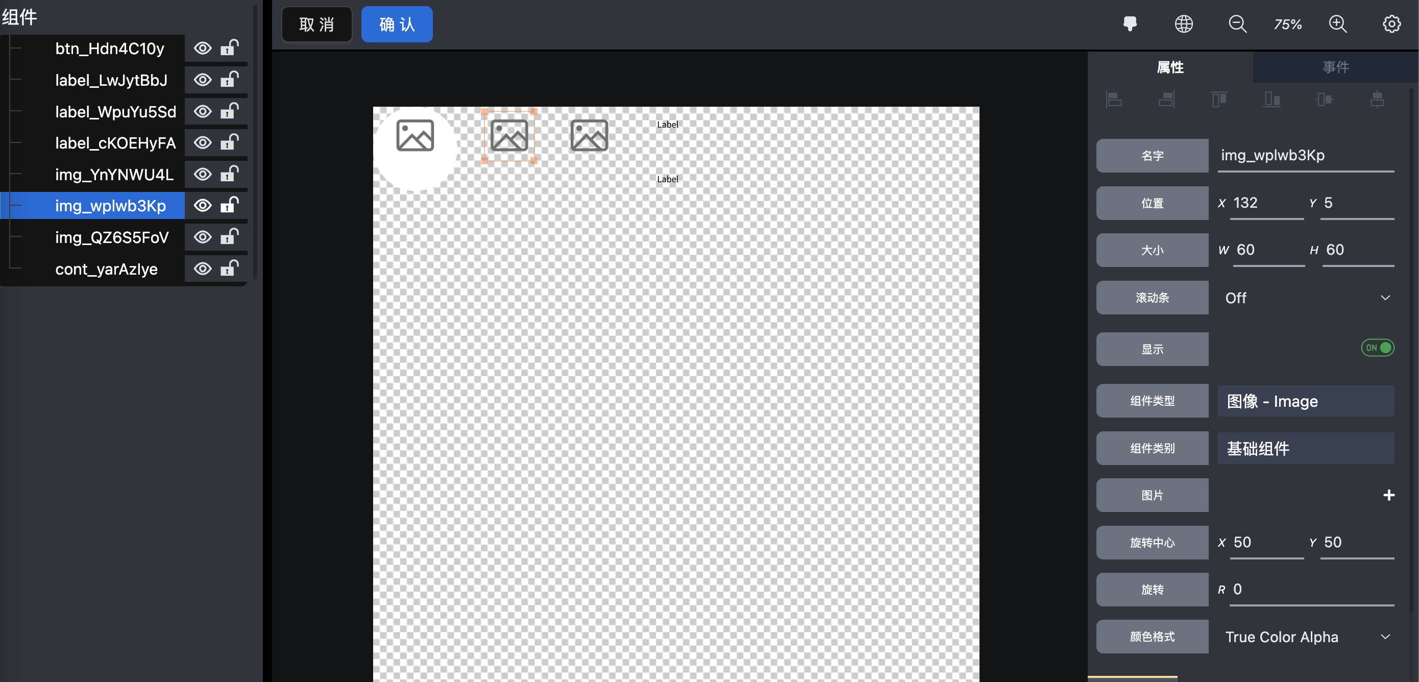
In HoC editor, you can change the attributes and styles of the wrapped widgets just like regular widget.
As for the widgets you don't need, you can hide them. Or, you can unhide the defaultly hidden widgets to enable more images and labels showing.
If the widget is hidden, it'll not be involved in code generation and building, just like they're don't exist.
State Button with all the widgets unhidden looks like:
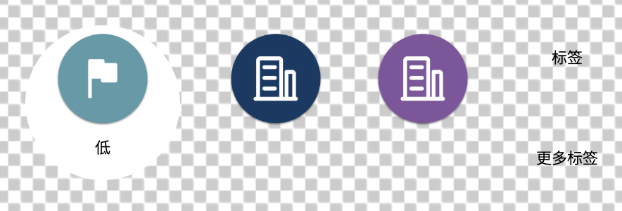
And the setting looks like:
If you prefer a sqaure shape with rounded corners, just right click the compoent and select Edit to change it. Just like this:
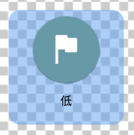
Well, it doesn't look nicely, but surely you can do a better job. It's your show time.
Once you have your own well designed State Button, you can right click it to save it as a Template Component and reuse it in your project.