Introduction
The State Button is a Higher Order Component that provides multi-state functionality for button-like interactions.
A common requirement involves buttons with multiple states that cycle upon user interaction. For example, an air conditioner control might cycle through volume settings: Low → Medium → High → Auto → Low → ... Each state requires distinct visual representations. Standard LVGL components such as Button or Image Button cannot achieve this behavior without extensive custom code development.
The State Button addresses this limitation by enabling configuration of multiple states, with each state supporting distinct images and labels. As the state transitions, the configured visual elements update automatically.
Component Structure
The State Button encapsulates the following components:
- Container (x1): Provides the background for the HoC
- Images (x3): Display images for each state
- Labels (x3): Display labels for each state
- Button (x1): Handles user interactions with transparent styling to ensure only images, labels, and background are visible
Attributes
The State Button provides the following configurable attributes:
States Configure the number of states for the HoC, with each state supporting:
- Up to 3 configurable images
- Up to 3 configurable labels
Current State Represents the active state of the HoC. This value can be modified to observe visual changes.
State Button Configuration
By default, the State Button displays one image and one label. To display additional images and labels, right-click the HoC and select Edit to access the HoC editor for configuration modifications.
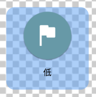
The default State Button configuration appears as follows: 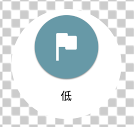
The default settings are displayed as: 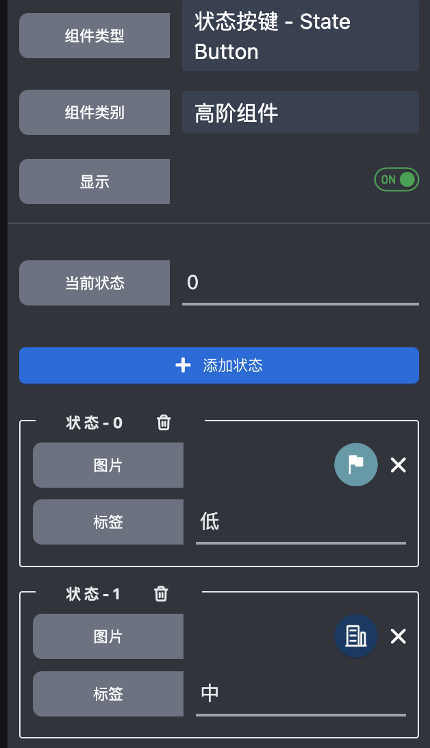
Layout adjustments can be made through the HoC editor, where encapsulated components can be repositioned similar to standard components.
Components that are not required can be hidden. Conversely, default hidden components can be unhidden to enable additional images and labels.
Hidden components are excluded from code generation and build processes, effectively treating them as non-existent.
A fully configured State Button with all components visible appears as: 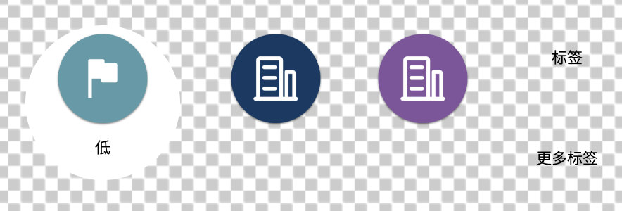
The corresponding settings are displayed as: 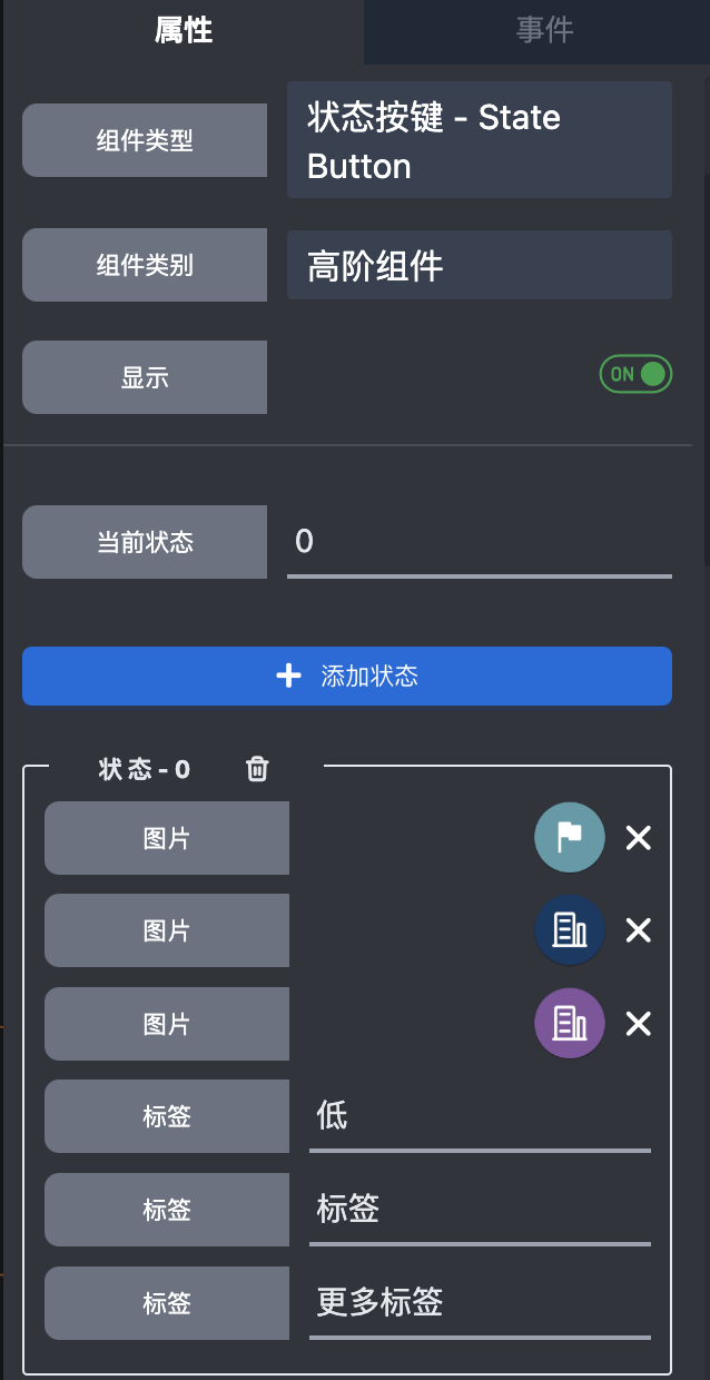
For alternative styling such as a square shape with rounded corners, right-click the component and select Edit to modify the appearance:
While this example may not represent optimal aesthetics, users can customize the design according to their preferences.
After creating a customized State Button, right-click to save it as a Template Component for reuse throughout the project.