Introduction
The Label Slider is a Higher Order Component that extends slider functionality with customizable labels and images.
Using an air conditioner control as an example, the Label Slider provides an elegant solution for volume adjustment. As users drag the slider, the volume level changes accordingly while a highlighted label indicates the current position. Visual indicators can be implemented to represent volume intensity. This component addresses common requirements for intuitive slider-based controls.
Component Structure
The Label Slider encapsulates the following components:
- Container (x1): Provides the background for the HoC
- Images (x3): Display images for each state
- Labels (x3): Display labels for each state
- Slider (x1): Handles user interaction
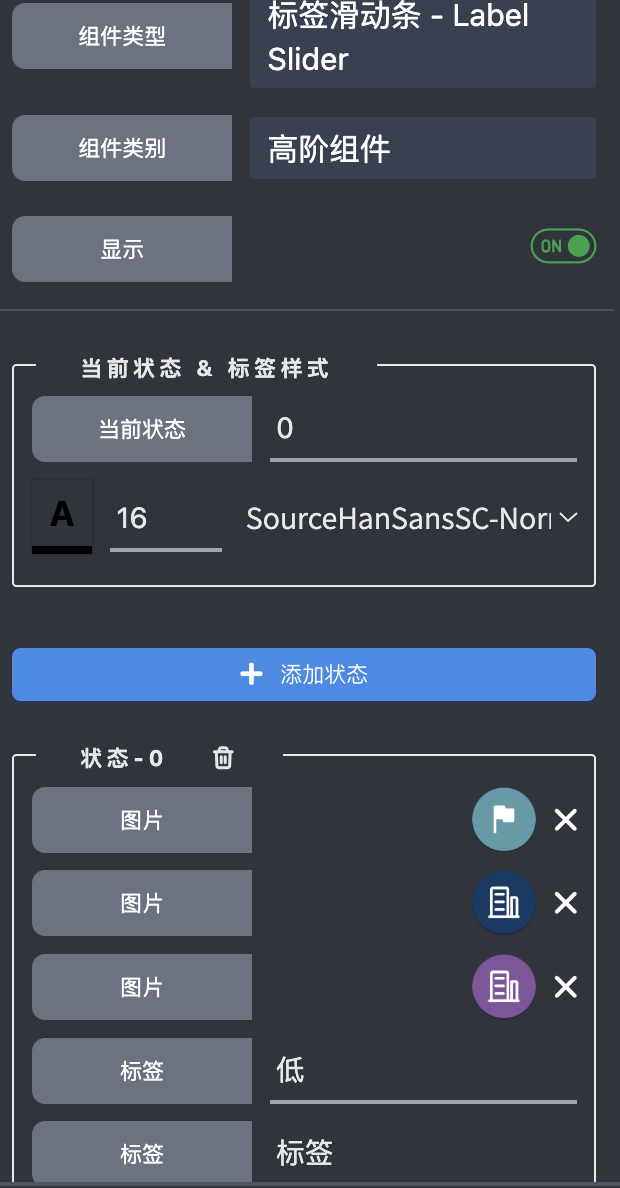
Attributes
The Label Slider provides the following configurable attributes:
States Configure the number of states for the HoC, with each state supporting:
- Up to 3 configurable images
- Up to 3 configurable labels
Current State Represents the active state of the HoC. This value can be modified to observe visual changes.
Slider Label
While up to 3 labels can be configured, one label serves as the slider label with semi-configurable positioning. This label automatically aligns with the slider's current tick position. For vertical sliders, the vertical position is automatically calculated, and for horizontal sliders, the horizontal position is automatically calculated. Users can only adjust the distance between the label and the slider.
Configuration
By default, the Label Slider displays two images and slider labels. To display additional images and labels, right-click the HoC and select Edit to access the HoC editor for configuration modifications.
The default Label Slider configuration appears as follows:

The corresponding settings are displayed as: 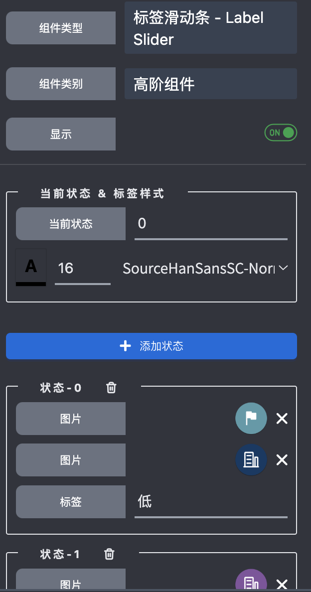
To customize the layout of images and labels, right-click and modify them using the same approach as with the State Button.
A fully configured Label Slider with all components visible appears as: 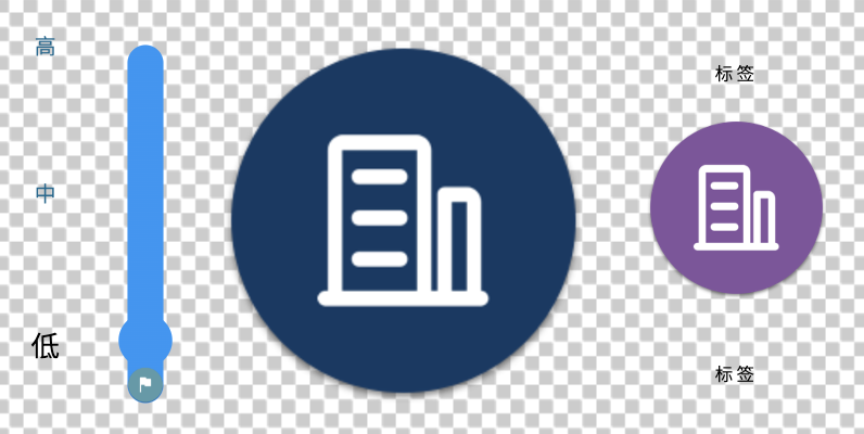
The corresponding settings are displayed as: