anyuianyui
Home
Getting Started
Documentation
Download
  • English
  • 简体中文
Home
Getting Started
Documentation
Download
  • English
  • 简体中文
  • Setup

    • Installation
  • Core Concepts

    • Introduction
    • Design
    • Hide and Lock
    • Resource Management
  • Higher Order Component

    • State Button
    • Label Slider
    • Value Slider
    • Check Group & Radio Group
    • StatusBar
    • NavigateBar
    • Drawer
  • Advanced Features

    • Use External Image File as Source
    • GIF Animated Image
    • Template Component
    • Global Components
    • Screen Management
    • Communication Commands and Events
    • Lottie Animation
  • Development

    • Build Mode
    • Build Toolchain Configuration
    • Code Transplant
  • Technical Support

    • FAQ

Overview

Global components are reusable components that maintain consistent appearance and behavior across an entire application. Modifications to global components are automatically propagated to all instances throughout the project. A typical implementation is a status bar that appears uniformly across all screens.

Global Status Bar

The Global Status Bar functions similarly to the Status Bar in the Higher Order Component category. The primary distinction is that the Global Status Bar maintains project-wide consistency, with any modifications automatically applied to all instances.

Implementation

To implement a Global Status Bar:

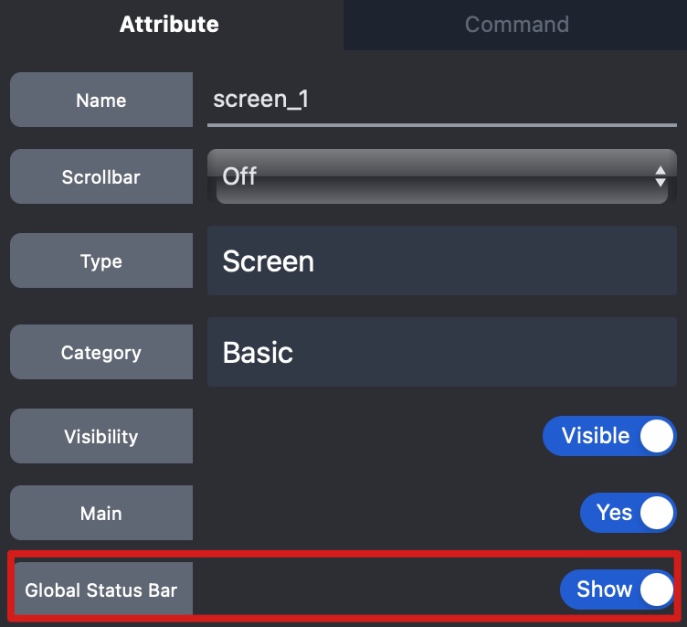
  1. Access the screen's attribute panel
  2. Enable the Global Status Bar option

Global Status Bar

Video Demonstration

Build Time Estimation

Prev
Template Component
Next
Screen Management