Layout
Flex Layout
Flex Layout is a powerful layout system that enables the creation of flexible and responsive user interfaces.
To implement a flex layout, utilize the Container component and configure its properties. When combined with percentage-based sizing, padding, and nested Container components, you can construct sophisticated flex layouts.
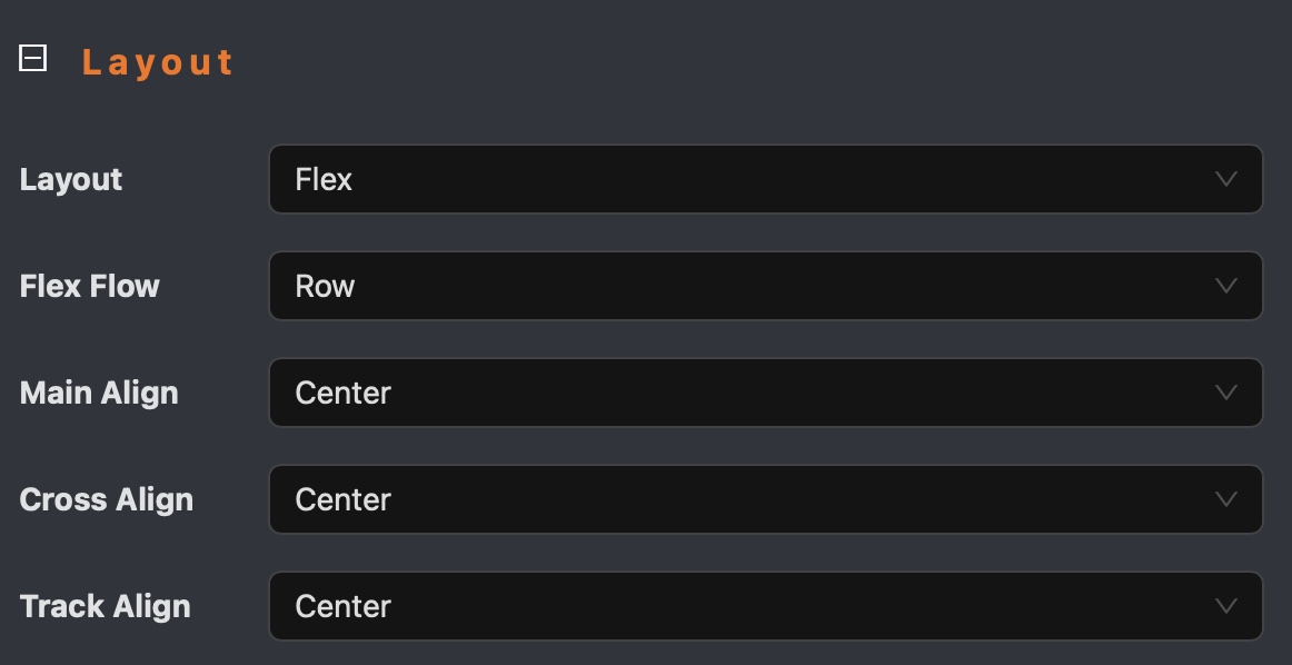
Flex Layout Configuration Steps:
- Create a
Containercomponent - Set the
layoutproperty toflex - Configure
flex flow,main align,track alignproperties - Add padding row/column to adjust space between children
- Use percentage-based sizing to ensure children components adapt to the container size
- If the children have fixed size, then you can set size of
ContainertoAutoto fit in content
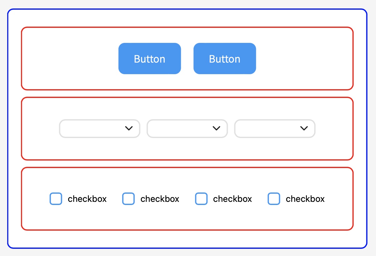
Flex Layout Example
The following example demonstrates a flex layout implementation using nested Container components.
Buttons, dropdowns, and checkboxes are automatically centered within the container without requiring explicit position settings.