Flag and State
Flag
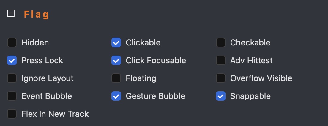
A Flag represents a capability that an LVGL widget possesses. For example, the clickable flag indicates whether a widget can respond to click events. A classic example of a clickable widget is a button, while a label is typically non-clickable by default.
For more detailed information about flags, please refer to the LVGL documentation.
Initial Flags
When a widget is created, it has predefined initial flags. For instance, a button is clickable by default, whereas a label is not. These initial flags can be modified according to your requirements.
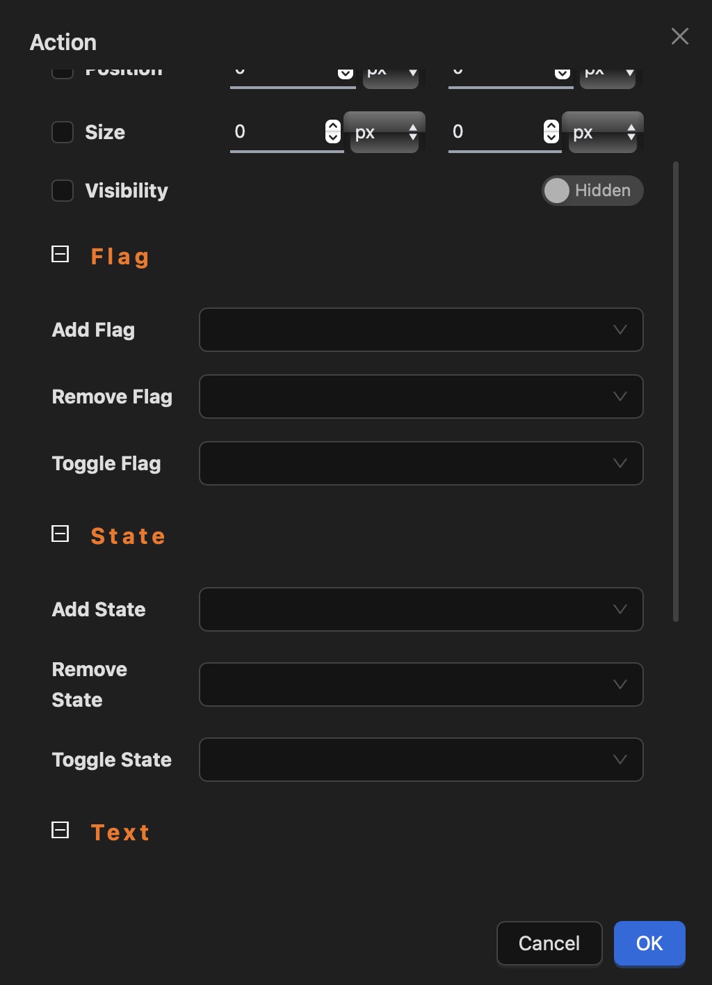
You can view and modify a widget's flags (add, remove, or toggle) using the widget inspector. For example, to make a button non-clickable, set its clickable flag to false. Conversely, you can enable clickability for a label by setting its clickable flag to true.
Modifying Flags
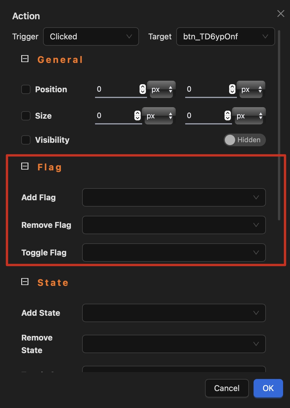
Flags can be modified (added, removed, or toggled) through actions or events. For example, you could make a button non-clickable after it is clicked by setting its clickable flag to false in the click event handler. While specific scenarios may vary, this demonstrates the flexibility of flag management.
State
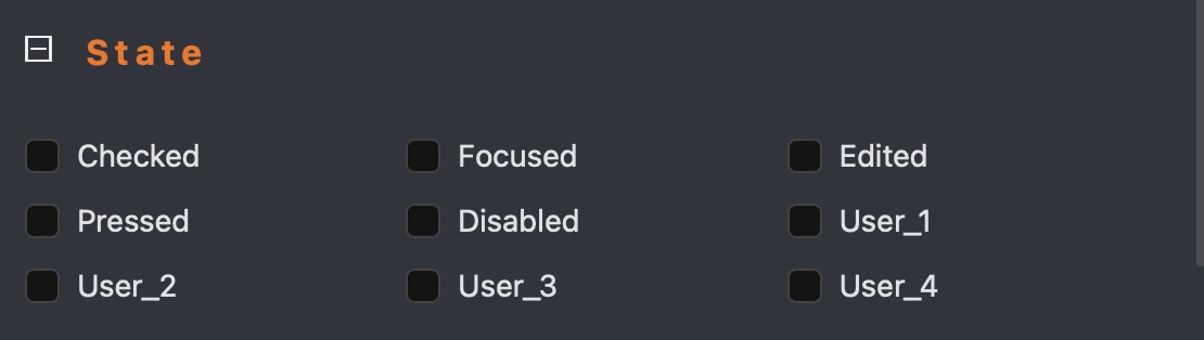
Widgets can exist in different states, which dynamically change based on user interaction. Consider a button: it initially starts in the "default" state, and when clicked by a user, it can dynamically transition to "focused", "pressed", and "checked" states (if the checkable flag is enabled).
For more detailed information about states, please refer to the LVGL documentation.
Initial States
When a widget is created, it has predefined initial states. For example, a checkbox is unchecked by default. These initial states can be modified according to your needs.
You can view and modify (add, remove, or toggle) a widget's states using the widget inspector. For instance, to make a checkbox checked by default, set its checked state to true.
Modifying States
LVGL handles state transitions automatically based on user interactions for typical widgets. For example, when a user clicks a checkbox, LVGL updates its checked state to true, and when the user unchecks it, the state changes to false. For buttons, if the checkable flag is enabled, the checked state will update accordingly. If the checkable flag is disabled, the checked state will remain unchanged.
For widgets like labels, which are not checkable by default, the checked state is not automatically managed by LVGL. However, you can enable the checkable flag for a label and manually control its checked state (setting it to true or false) according to your application logic.
States can also be modified (added, removed, or toggled) through custom actions or events. For example, you could programmatically set a button to the checked state after it is clicked by updating its checked state to true in the click event handler.