anyui provides an intuitive visual design environment for creating sophisticated user interfaces. The platform offers drag-and-drop functionality with precise component layout controls, enabling efficient UI development.
Create Components
Initialize your interface by adding components from the widget library. Drag the required components onto the canvas to begin prototyping and constructing your user interface according to your design specifications.
Select Components
Click on any component to select it. Upon selection, the component's properties, styles, and event handlers become accessible in the side panel, allowing for detailed customization of all design aspects.
Multi-Select Components
There're several ways to select multiple components:
- Holding the
Ctrl/Cmdkey while clicking on each desired component on the canvas. - Holding and dragging the mouse to select multiple components.
- Holding the
Shiftkey while clicking on each desired component on the widget tree to select a range of components, orCtrl/Cmdkey while clicking on widget tree node to select components continuously.
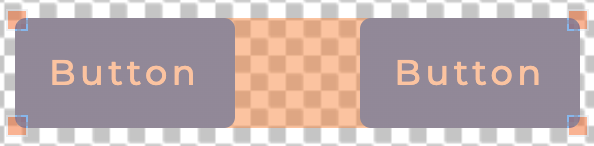
The selected components are visually distinguished with orange highlighting for clear identification.
Move Components
Reposition components by clicking and dragging them across the canvas. During movement, alignment guidelines automatically appear near the edges or centers of adjacent components and the canvas boundaries, ensuring precise component placement.

Resize Components
Adjust component dimensions by clicking and dragging their edges or corners. Alignment guidelines assist in maintaining consistent sizing and positioning throughout the design process.
Proportional Resizing
Maintain component aspect ratios during resizing by holding the Ctrl/Command key while dragging. This ensures proportional scaling without distortion.
Duplicate Components
Efficiently create multiple similar components by selecting the source component and holding the Option/Alt key while dragging to the desired location. This feature is particularly useful for creating consistent UI elements such as menu items, buttons, or repeated design patterns.
Delete Components
Remove components from the design by selecting them and pressing the Delete key, or by accessing the "Delete" option through the context menu.
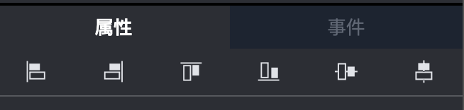
Align Components
With multiple components selected, utilize the alignment tools in the alignment panel, located above the screen area. These tools provide precise alignment controls that ensure consistent spacing and positioning for a professional appearance.
Zoom Controls
Easily zoom in and out of the design canvas by Ctrl/Cmd + mouse wheel, or utilize the zoom controls available in the toolbar.
Pressing the zoom reset button will restore the canvas to a 100% zoom level.
Move Canvas
Move canvas by dragging the canvas area beyond the screen boundaries.
When the mouse cursor is positioned within the screen area, the default drag behavior enables multi-selection of components. However, holding the Spacebar key temporarily switches to canvas moving mode until the mouse button is released.