What is a Higher Order Component (HoC)?
A Higher Order Component is a composite component that encapsulates multiple components with predefined behaviors for self-managed UI state control.
Capabilities
HoC components offer the following functionality:
- Selection, duplication, deletion, dragging, and movement as a unified entity
- Visibility toggling
- Visual customization through editing
- Predefined behavior management for UI states, such as
StateButtonwhich automatically synchronizes image and label updates based on state changes, allowing developers to focus on business logic
Limitations
HoC components have the following restrictions:
- Direct resizing is not supported; modifications require changes to wrapped components
- Addition, removal, or reordering of encapsulated components is prohibited
- Behavioral modification of the HoC is not permitted
Using Higher Order Components
To utilize HoC components:
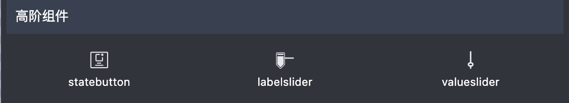
- Expand the WidgetBar to reveal the HoC section:

- Drag and drop the desired HoC from the WidgetBar to the screen
- Use the HoC as you would a standard component